
*This was a personal project and none of this work is associated with the company.
Can small changes have a big impact?
I'm an avid Glassdoor user. I am also curious about small changes in design which can have a large impact on the user experience. Therefore I set out on foot to the Westfield Mall to perform some “guerrilla" usability testing and see if I could any quick fixes that could make a serious difference.
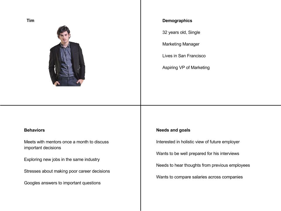
But before we dive into that, let’s take a look at the Glassdoor user.
Persona
Problems users faced
Users generally had a difficult time finding the information they wanted in certain views. More specifically:
On the companies view, most users were confused as to why they couldn't filter or sort.

On the salaries view, the filter is in an unfixed position at the top of the view. Users would generally start scrolling through the salaries, only to then realize that they can’t find the salary for the job they want, look for filter, and not be able to find it.


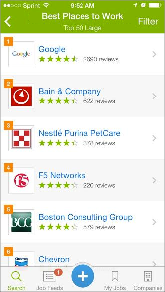
On the "Top Companies" view, most users wanted to refine the list by categories including location, industry and company size but couldn't because of the lack of filtering or sorting options.

Solution: Small fix, big Impact
Here’s a simple but possibly very effective solution to this problem:
Standardize the the navigation in each view and include a filter on the top right of that navigation. The goal is to establish a standard sorting convention across views. I predict that users will learn the filtering convention and as a result have an easier time finding information they want in each view.
Here is a before and after of of the views affected:


Next Steps:
Test a version of the app with the new header and look for a statistically significant improvement in engagement time and logins per user.