
The Product
URX (YC '13) is building the world's first App Search API, which lets developers find and link users directly to relevant content inside other apps to create a seamless experience across multiple apps.
The challenge
We were asked to test and improve a new immersive view, which allows users to view several different pieces content from multiple partner apps at once.
My Role
I worked on usability testing, synthesis, and concept ideation. I also explored a different interaction and visual design after the project was completed.
The original FLow

Usabilty Testing
We set out to Westfield Mall in downtown San Francisco to test the experience with users. Our main goal was to test the overall usability of the immersive unit. Did understand what they were viewing? Did the flow make sense? Did the experience make sense?

Affinity Mapping
As a team, we grouped the difficulties that users faced to look common problems that users faced.

Findings
We found a few main problems:
- The link to the immersive view didn't properly set expectations for what the users would see in the next view
- Users had trouble differentiating content and content providers.
- Users didn't understand the horizontal swiping functionality.
- The immersive view lacked trust with users. It felt foreign and out of place.
Concept Generation
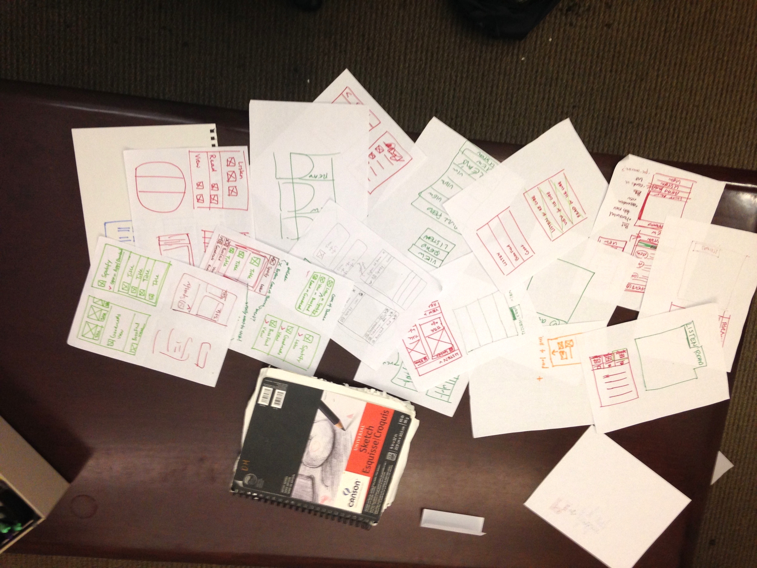
As a team, we brainstormed several views that solved these problems through multiple 5 minute design sprints. As a team, we debated between different 2 concepts that are explored below:
The winning design
Low fidelity

We chose a "scrolling header" design to keep the experience relatively simple while allowing for content from multiple apps.
We also aimed to accomplish the following:
- Differentiate the content with strong visual treatment
- Eliminate any confusion about horizontal swiping by only allowing vertical scrolling
- Match the brand of the content providers to create a sense of trust
- Set expectations with a link that provides a preview to the immersive experience
The revised flow

Next steps
We suggest that URX test the new view along with the initial view and compare click through rates.
Alternative Concept

After the project, I decided to explore the other view we discussed, which is slightly more conventional. Rather than scrolling headers for each section, there is a fixed tab bar at the bottom. This design may be more intuitive since tabs are more common than scrolling headers.
The downside to this design is that it limits the number of partner apps to 4. In my opinion, from a design perspective, this isn't bad because the user won't be overwhelmed with too many choices. (This is known as Paradox of choice). Ultimately this is a business and product decision that should be made using user behavior data and business needs.