
The Product
URX (YC '13) helps publishers monetize their mobile content by allowing users to directly take action inside native sponsor apps. Sponsor apps pay URX (and thus the publishers indirectly) for activity or new users.
Example: As a user, when I am reading an article on Billboard.com's (the publisher) mobile site about Kanye West, URX gives me the ability to directly listen to him through Spotify (the sponsor). In this case, Spotify pays URX per song, and URX then pays Billboard.
At the time of the consult, the team was planning on launching a new immersive view, which would give publishers the ability to link out to multiple sponsor apps at once (and thus provide more ways to make money) without interfering with their published content.
The challenge
While an immersive view makes sense from a business perspective, what would users think of it? We were tasked with answering this question and providing recommendations to the URX team based on our findings.
My Role
I worked on usability testing, synthesis, and concept ideation. I also explored a different interaction and visual design after the project was completed.
The original FLow

guerRilla Usabilty Testing
We set out to Westfield Mall in downtown San Francisco to perform *guerrilla usability testing. Our main goal was to test the overall usability of the immersive unit. Did understand what they were viewing? Did the flow make sense? Did the experience make sense?

*Guerrilla usability involves approaching strangers in public spaces to test basic assumptions about products. While it has some limitations compared to traditional usability testing, it's much faster and cheaper.
Affinity Mapping
As a team, we grouped the difficulties that users faced to look for common problems:

Findings
We found a few main problems:
Linking into the unkown
The link to the immersive view didn't properly set expectations for what the users would see in the next view.
Lack of content differentiation
Users had trouble differentiating content and content providers. This made the experience confusing to these users.
Horizontal Swiping confusion
Users didn't understand the horizontal swiping functionality. These individuals thought they were only able to vertically scroll.
General lack of trust
The immersive view lacked trust with users. It felt foreign and out of place in the experience.
Concept Generation
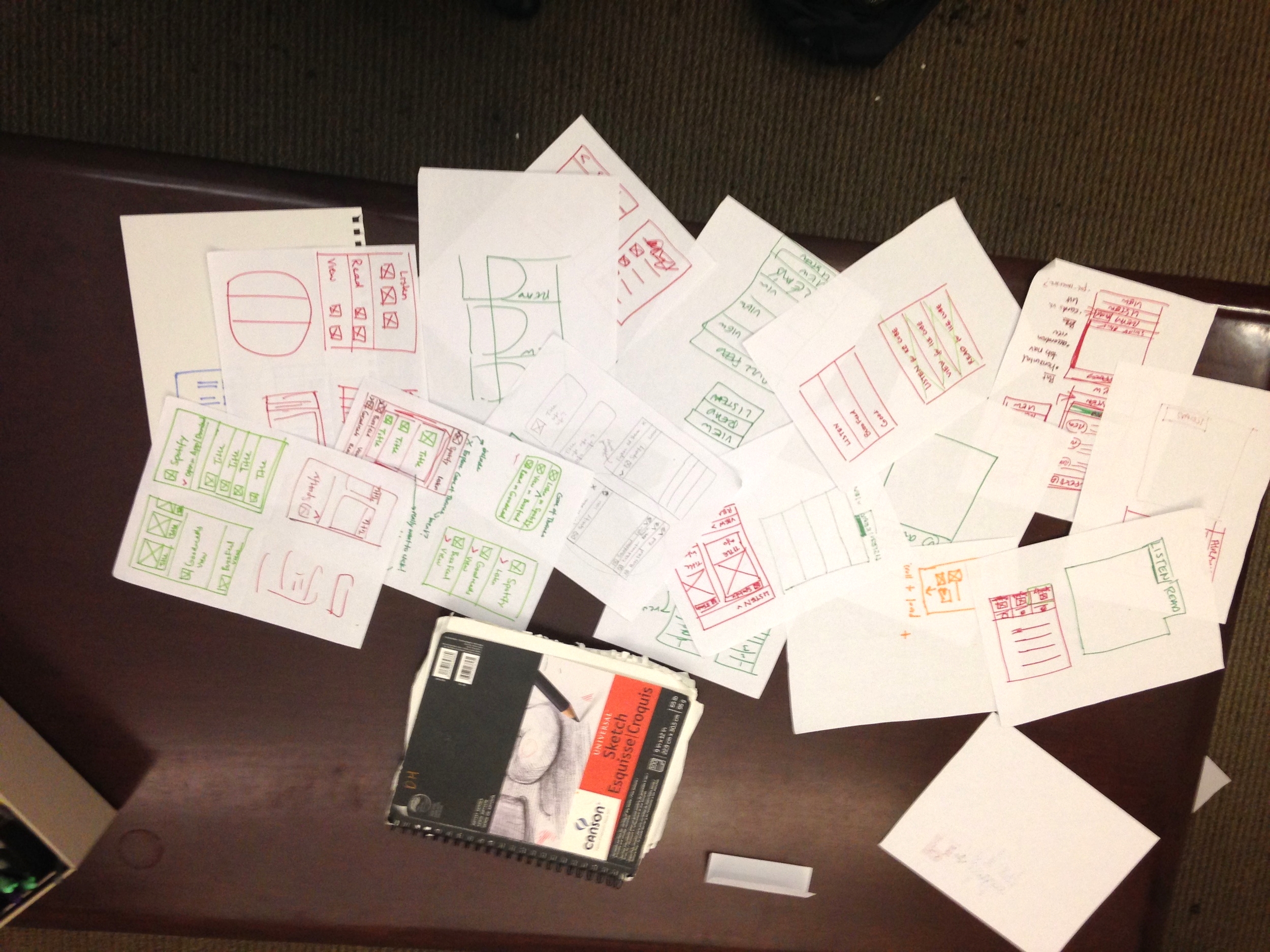
As a team, we brainstormed several views that solved these problems through multiple 5 minute design sprints. We debated between different 2 concepts that are explored below:
The winning concept: Scrolling Header
We chose a "scrolling header" design to keep the experience relatively simple while allowing for content from multiple apps. When testing these designs, (6/6) users had no issues going through the new flow. We believed this was enough evidence to move with and recommend live testing this design.

Additionally, here is how we believed the design addressed each problem with the original product:
Problem
LINKING INTO THE UNKOWN
The link to the immersive view didn't properly set expectations for what the users would see in the next view.
LACK OF CONTENT DIFFERENTIATION
Users had trouble differentiating content and content providers. This made the experience confusing to these users.
HORIZONTAL SWIPING CONFUSION
Users didn't understand the horizontal swiping functionality. These individuals thought they were only able to vertically scroll.
GENERAL LACK OF TRUST
The immersive view lacked trust with users. It felt foreign and out of place in the experience.
Solution
Button provides a preview
The button that links to the immersive should visually represent the immersive unit.
Strong Visual Treatment
The visual style of the immersive unit content should be distinct and clearly differentiated by source.
Vertical Scrolling Only
Eliminate any confusion about swiping by only allowing vertical scrolling.
MATCH THE CONTENT STYLE
The style of the content in the immersive unit should match the style of the source of app .
The revised flow

Next steps
We recommended that URX test the new view along with the initial view and compare click through rates. If the revised view has a statistically significant higher clickthrough rate to partner content, we recommend using that view over original.
Alternative Concept: Tab Navigation
After the project, I decided to explore the other view mentioned above, which is slightly more conventional. Rather than scrolling headers for each section, there is a fixed tab bar at the bottom. This design may be more intuitive since tabs are more common than scrolling headers. Additionally, limiting the the number of tabs to 4 helps prevent the user from being overwhelming with too many decisions (i.e. paradox of choice (i.e. Paradox of choice). If I presented this to the client I would recommend A/B testing it along with the original and other revised design and comparing click-through rates.
